This article is more than 1 year old
Tokyo rebrands 2020 Olympics
New logos trade 'plagiarism' for 'elegance and sophistication'
LOGOWATCH Tokyo has whipped the covers off a couple of new logos for the 2020 Olympics, after it was forced to bin the previous brand frontage over plagiarism claims.
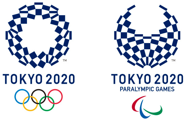
According to the organisers, Asao Tokolo's "harmonized chequered emblem" featuring "the traditional Japanese colour of indigo blue expresses a refined elegance and sophistication that exemplifies Japan".
To the faint sound of whalesong, the blurb continues: "Composed of three varieties of rectangular shapes, the design represents different countries, cultures and ways of thinking. It incorporates the message of 'unity in diversity'. It also expresses that the Olympic and Paralympic Games seek to promote diversity as a platform to connect the world."
Beautiful. The first logo selected - by Kenjiro Sano - was quietly ditched after Belgian artist Olivier Debie claimed it was a rip-off of his design for the Théâtre de Liège:
![]()
®
