This article is more than 1 year old
Power BI: Office 365 just got more intelligent
How clever is the latest addition?
Review If a picture tells 1,000 words, then an interactive bubble chart indexed by year based on a data model with a hierarchy of sub-categories ought to speak volumes.
Microsoft’s business intelligence product Power BI is the latest addition to Office 365, its online office suite designed to integrate with desktop versions of Office.
Power BI was released last summer in preview mode, and earlier this year Microsoft made it fully available as part of Office 365.
It is an attempt to marry advanced spreadsheet reporting features with back-end collaborative features based on SharePoint.
So how well did Redmond execute?
This isn't a packaged product. Instead Power BI is a collection of features bundled together under a single heading and aiming to enable members of an organisation to share reports with each other.
Explore the world
Some of those features are additions to Excel that beef up its business intelligence capabilities, moving beyond the simple charting and pivot table functions we have seen in previous versions.
Power Query is the starting point for these tools and we had to download that as a separate add-in for the spreadsheet program.
One of the best features of Power Query is its ability to pull in data sets from online sources. You can import data sets from databases and files, using the “Get External Data” section of the Power Query menu.
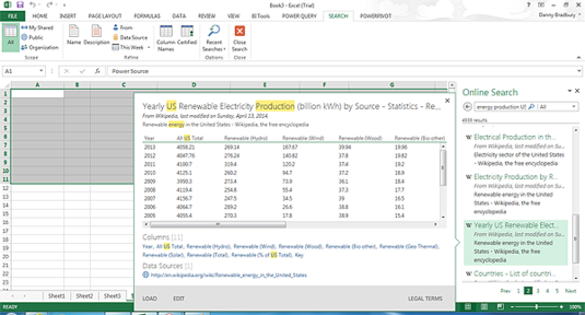
You can also enter a web URL directly, or even search for data sets online. This seems to scrape data from different places, even Wikipedia tables.
You can search for publicly available data online and load it as a query using Power Query. Most of it seems to come from Wikipedia pages.
Importing this data makes it available as queries inside Excel, which can then be manipulated. Queries can be merged with each other, for example, and shaped to remove specific columns. Even merges can be merged to create aggregated data sets from multiple, relatively simple sources.
Once this data has been massaged effectively, it can be folded into a data mode using Power Pivot, which can then be manipulated further, creating relationships and data hierarchies. When that is complete, you can visualise the data using the Power View function, which is also installed when you update Excel with Power Query.
This is a way to produce interactive charts that you can share with others using the collaborative server-side functionality in Power BI.
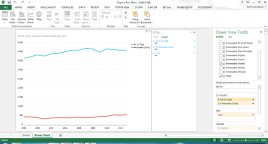
The Power View, which you access via the Insert menu, starts with a view of the fields in your data model. You drag the fields that you want to visualise onto the main Power View sheet and it creates a table.
You can then access different chart types from the Design menu ribbon. Excel shows you different chart types, based on the data in your table.
You can drag fields from your data model into Power View, to create a table…
...which can then be turned into charts far more sophisticated than our effort. Did we mention that we are better with prose?
Tiling is an important part of this interactivity, and it is pretty powerful. When you want to show complex data sets (for example, population and pollution data over a certain period), referenced by a particular field (say, US state), you can select that reference field to tile by.
This creates a sequence of US states, each of them clickable and each bringing up a tile displaying the data for that state in chart form. It is a good way to present a lot of data in a small space.
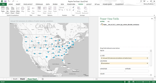
Power Maps is the other item in the Excel toolbox. Selecting “Map” when visualising that Power View data presents a set of field options, including a location field. You can drag a field containing one of several location types, including cities, counties and countries, and it will parse them automatically, superimposing them onto an interactive Bing map.
This map shows carbon emissions by US state, cribbed from Wikipedia. The mapping function is automatic.
These interactive reports are all very well but they are not much use without the ability to share them. This is where Power BI comes in. The system uses SharePoint for users to collaborate and view reports and workbooks.
Installing Power BI is not necessarily an easy process. Before you can take advantage of the software, you must have an organisational account so that an administrator can add a member of that organisation as a Power BI user.
Grown-up version
It is not something you will be able to set up on your student Office 365 subscription, and neither would you want to. This is an enterprise product for creating collaborative business intelligence reports.
Typically, an organisational user will have an Office 365 E3 licence or some such to use the professional software products underpinning Power BI. The site takes a few minutes to provision the service once you have added it into your administrative account.
The administrator must then add Power BI users, either individually or en masse, via Azure Active Directory integration or by uploading a CSV file.
The Power BI administrator can set up data sources locally on the company's premises by installing a data gateway. This can then be used to serve up organisational data via OData, Microsoft's open-data protocol that the Organization for the Advancement of Structured Information Standards finally standardised in March.
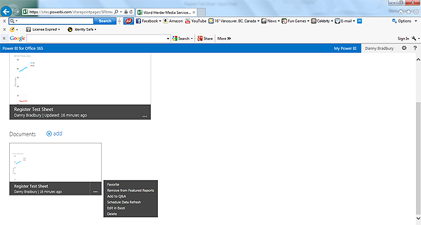
Power BI installation automatically creates a Power BI site on SharePoint. Once users have produced a report from their data model, they upload it manually to the Power BI site. This creates a thumbnail of the last sheet used in the spreadsheet, which is typically the data visualisation.
These interactive reports are then usable by others, and they are analysed by Power BI within SharePoint so that you can search for them by asking natural language questions.
You can upload your nice new report and tag it as featured so that everyone can see your handiwork.
The other elements – the data queries – are more easily shareable. They can be uploaded directly from within Excel and you can then see who is using them.
Power BI is a combination of server-side and client-side functionality, and it is powerful as far as it goes. Its biggest drawback is Microsoft’s walled-garden approach. There is limited opportunity for sharing these gorgeous reports with users outside an organisation.
For your eyes only
You can do it, but without the support for larger, 250Mb workbooks that comes with Power BI (Excel for Office 365 normally supports only 10Mb worksheets).
And the Windows 8 app that Microsoft provides as a viewer for Power BI docs won’t play well with external users. Microsoft says it is “thinking about how we can support those but this is not the focus of the current release”.
The best things about the tools behind Power BI are the excellent self-serve BI tools in Excel, some of which are new incarnations of old products (Power Map was previously GeoFlow, for example).
Revamping them and putting them all under the Power BI banner turns Excel into a more significant reporting tool, with promising opportunities for presenting real insights. ®


